
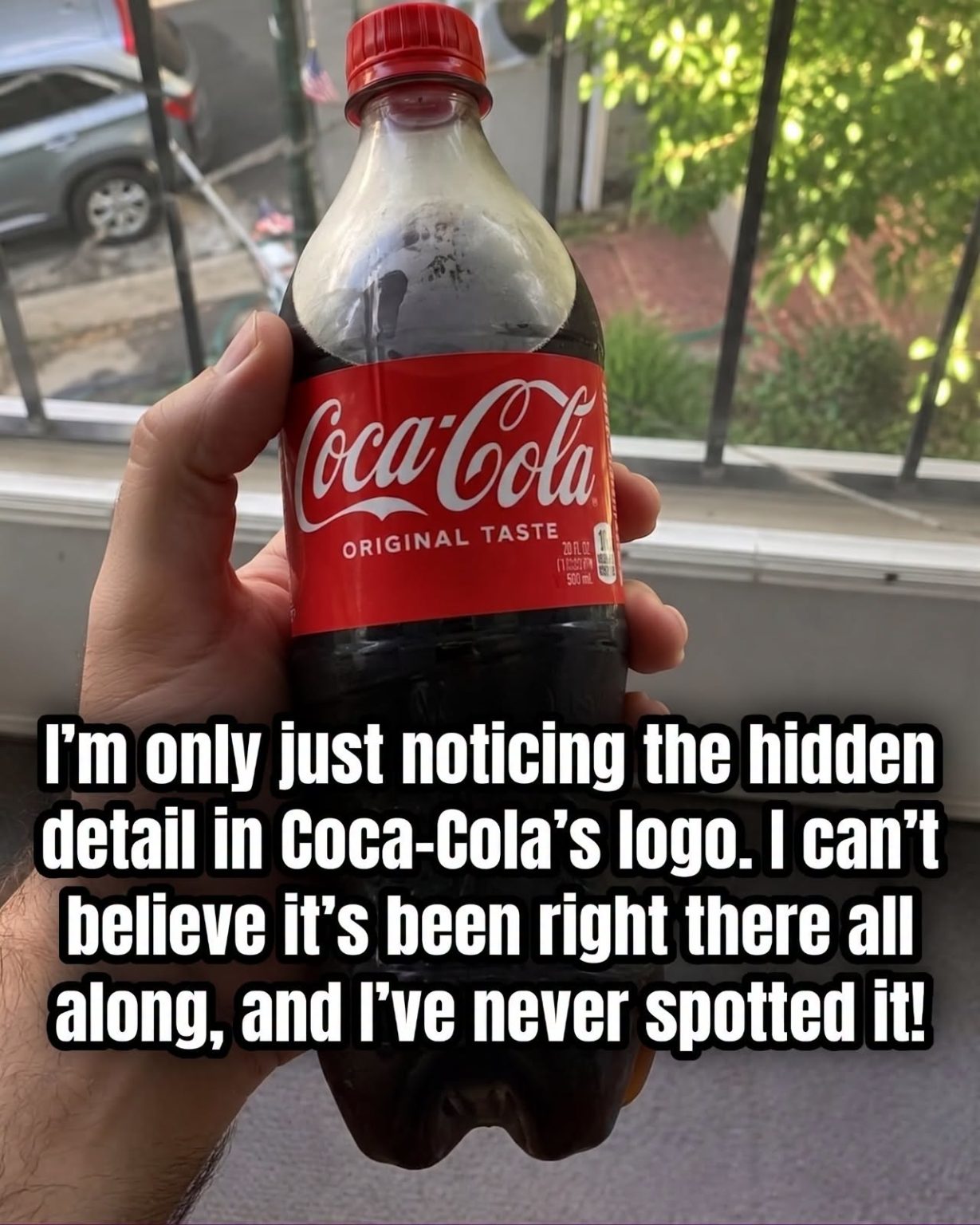
the familiar Dynamic Ribbon and Arden Square
2007: A simplified design featuring a single white ribbon
Despite all those changes, the recognizable script remained atthe heart of the identity.
It’s Not the Only “Secret” People Have Found
The Coca-Cola logo has inspired plenty of theories and supposed hidden messages over the years.
That’s partly because the lettering is so distinctive. Curved letters, unusual loops, flourishes, and overlapping shapes naturally give people plenty to examine.
Some alleged meanings have been widely circulated online without solid evidence, while others are simply examples of people finding recognizable shapes in an elaborate design.
The



Comments